Branding [en]
Salubris
Innovations for healthcare
Concept
The healthcare solutions of Salubris give people hope, even in remote areas. The products are reasons to be proud of Salubris. We captured this in the branding, emphasizing positivity, clarity and transparency.
Logo: Bacteria and health
Isolation and growth of pathogens is an important activity of Salubris. This inspired us to use the dotted shapes and color gradient of bacteria colonies.
The dots give a sparkling impression and can also be seen as versatile ideas that emerge and grow. Reducing the edges of the design, they give the logo a more open appearance. This combined with the original logo shape [a yin-yang based logo], emphasizes the associations with balance and health.
Businesscard
We combined the businesscard and a small flyer. The most important products are introduced without the need of a seperate flyer. It is an extension on the website, which we made available for all platforms.
To further enhance the positive view, we made a personal introduction text.

Front

Back

Inside
Typefaces
A modern and friendly typeface is chosen for the name of the company. We adapted it slightly to give the name more weight and increase the readability. One can also use the wordmark on itself, a feature necessary for some of the products.
The supporting typeface for bodytext [Lato] is a free, easy to installe and clear readable typeface in all anticipated circumstances.
The typeface is slightly adjusted to make the wordmark even more beautiful and recognizable.
Colors
We used different hues of blue and yellow, combined with a lot of whitespace. These colors are chosen for their strong association with healthcare and trust. The right implementation can give the materials a very open atmosphere.
Yellow
Most medical companies use either blue or blue combined with red-orange. Using yellow as a striking color makes Salubris stand out from the many others, and in that way recognizable.
Yellow is often associated with innovation, optimism and clarity. It refers to the innovative and accessible side of Salubris, giving more warmth to the brand.

A lot of whitespace refers to cleanness and openness.

This subdued yellow implies a more human touch.
Icons
A collection of icons are designed to make communication easier. Though very simple and clean, these elements support the text, increase understandability and make products or processes recognizable.
These icons can be used on products, in flyers and many more applications.
Clean lungs, the ultimate goal of the tuberculosis diagnostic tools of Salubris.
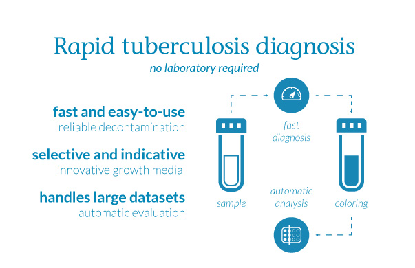
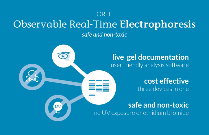
Infographics
A few infographics are developed for the businesscards, for on the packaging and for presentations. Some of the icons are used in these infographics.
When the need arises, these infographics can easily be adjusted to bigger, more explanatory graphics, to support the products in more detail.
Whitespace
Whitespace is excessively used in this branding. Margins are big, photos are clearly separated from the body text and elements are sparsely used. All this white space is added to give text an open appearance and facilitate reading.
Styling guide
All these elements and many more tips are collected in the styling guide. If you like, you can download it here [12 MB].

Page with text and pictures. Margins and whitespace clearly visible.
Communication
Positive
Salubris is positive innovation. Our design and communication advice supports this with positivity, clarity and transparency. You have already seen some design examples. Here we give a few impressions...
We at Salubris believe in a better world through access to reliable treatment. And treatment begins with diagnostics.
That is why we provide you with the best cutting edge technology on disease diagnostics.
... and one which emphasizes the innovativity of their products ...
Most of our products can be used on the spot. We eliminated the use of laboratories and experts as much as possible.
Payoff
The payoff is usable in several ways. The payoff refers to the innovative products, and through the particular choice of words it has a positive vibe. Because Salubris offers a variety of services, the payoff is made to be adjusted to specific products or services.
Some examples:
- diagnostic tools for healthcare
- research for healthcare
- solutions for healthcare
Website
The website is also designed and developed by 2MW.
Poster
Too show the implementations of a logo, 2MW provides several examples of flyers, infographics and posters. In these publications the guidelines are followed and communication examples are shown. This way the client gets a great set of examples to show his business.
These examples are all made to be used for real.

Example design of a poster.
Packaging
To take full advantage of the new branding, we proposed new packaging. Everything got colorcoded, to prevent mistakes by users. With some of the icons and infographics on the side, everyone can easily see what these products are intended for and the packaging becomes very recognisable.

Bedankt voor uw aandacht!
Too Many Words is ook nieuwsgierig naar u.
[javascript protected email address]
Liever bellen?
Lees meer op Linkedin.
of volg Too Many Words op Twitter.